


Adding Text to Your Reel
Adding text to your reel is just plain cool. But, there are some tips we would like to share to help ensure you get an awesome reel.
*Adding 3D Text With Our Text Tool *Pictures With Text Already Included *Choosing the Right Text Size *Picking Smart Colors and Fonts Adding 3D Text With Our Text Tool
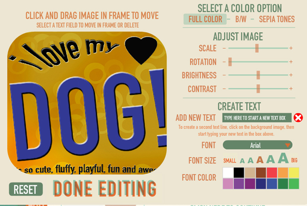
First and foremost...one of the coolest things about our Reel Builder is that you have the option of adding 3D text to your frames!
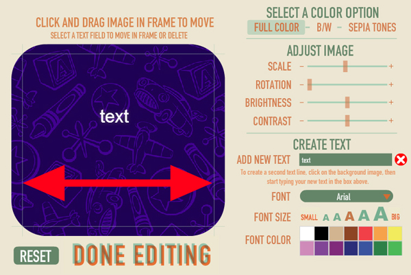
To add 3D text, all you need to do is use our text tool when building your reel. You can change the color, manipulate the size, and move it to any desired position around the frame.
When you move your text around, you will notice guidelines pop up alerting you how far your text can go. It is very important to make sure your text does not go outside the guidelines. For the best results, keep your text away from the guidelines altogeher.
The reason your text cannot go beyond the guidelines is because of the 3D technology working behind the scenes. You know how you see 14 images on the reel, when really there is only 7 frames? This is because you need a left eye image and a right eye image for each frame. The way 3D works is by shifting the layers on the left side to the right and the layers on the right to the left. So, if you have it too far over, it risks being cut off during this shift. This is especially true if your text is placed where the corner is rounded.
Therefore, it is best to keep your text away from the guidelines and away from the very top corners of the frame.
 Pictures With Text Already Included
Now sometimes, customers like to get really creative and design their text-filled frames outside of our Reel Builder, in Photoshop, for example. This is great, but there are a few very important points to consider.
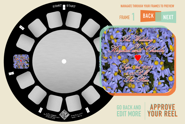
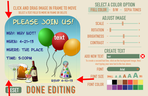
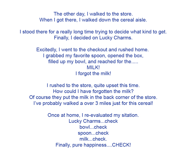
This picture looks nice, right? All the party information is informatively typed out, it's designed evenly, and fills out the entire frame completely.

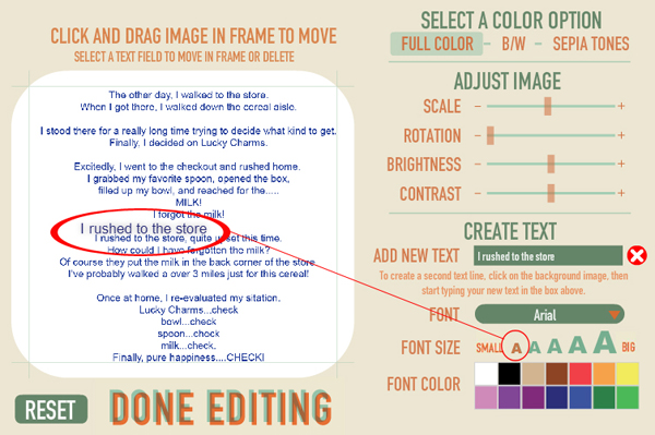
But uh oh! After uploading the picture, your text falls outside of the text guidelines. It is essential to stay within the guidelines, otherwise your text will be cut off.
Now, you only see the guidelines if you are using our text tool. So, after uploading your picture with text already on it, you will need to test that your words are inside the guidelines. To do this, add a "dummy" text line. Just type something into the text tool and move it around the screen. You will be able to see the guidelines and compare it to your text. Then, just be sure to delete the text box by clicking the big red X.
The reason your text cannot go beyond the guidelines is because of the "viewer technology" working behind the scenes. You know how you see 14 images on the reel, when really there is only 7 frames? This is because you need a left eye image and a right eye image for each frame. The way it works is by shifting the layers on the left side to the left and the layers on the right to the right. Then, when you look at it through the viewer, they converge back to the center. So, if you have it too far over, it risks being cut off during this shift. This is especially true if your text is placed where the corner is rounded.
This next picture shows the importance of staying away from those rounded corners.
See how this picture is nicely filled up with text? See what happens when it is uploaded...

The rounded corners cut it off!
To fix it, you can zoom out on your picture, but keep in mind that now your picture will not fill up the entire frame.
A better solution? Leave yourself plenty of "bleed space" around the edge of your pictures. This will leave a buffer of empty space and ensure your text will not be cut off.
 Choosing the Right Text Size
When adding text to your picture before uploading, it is imperative to make sure that you do not make your text too small. What may look fine in Photoshop, does not always work with the reel and viewer.
Remember, your images are being shrunk down to a size that is less than 1 inch by 1 inch. If your text is really small and you choose a font that has fine lines, it will get distorted and be illegible.
Take this picture for example. I typed a large amount of text and it looks great and totally legible.
But, adding it to the Reel Builder shows a different story...
A good an easy way to test if your text size is big enough is to use our text tool as an example.
Upload your text-filled picture. Then, type in a few words from your text, and choose the smallest font size we offer. Now, put it next to your text and compare. Is your text smaller that our smallest size text? If so, you will need to increase the size of your text before uploading.
Or, better yet, use our text tool to ensure your text can never be too small.
 Picking Smart Colors and Fonts
This is important for both do-it-yourself and using our text tool!
Rule of thumb is just to pick good background/font color combos.
For example you wouldn't do silver on top of white, because it just doesn't pop. But now silver on top of black, that pops!
It is also recommended that you do not use overly-cursive or funky type. If you must, make sure it is very large.
Remember, your images is being shrunk down to a size that is less than 1 inch by 1 inch.
Here is an example of a cursive-type font. The picture doesn't look too bad, but once it is shrunk down for the reel, it gets harder to read. Also, the background is so busy that it decreases visibility when mixing it with cursive font.
Just think of your recipients eyes! Would Grandma be able to read what it says?